Why Does Your Vibe-Coded UI Still Feel a Bit Like a Demo?
Sometimes, when I first look at a page built through vibe coding, I get a very subjective feeling:
The functionality is all there, but it still feels a little like a demo.
It is not unusable, and it does not necessarily look bad.
Look at each part on its own, and each one seems pretty reasonable.
But put it all together, and there is still a bit of a demo feel.
Where does that feeling actually come from?
A few things I suspected at first
At the start, I honestly was not sure which layer was at work.
Maybe it was visual finish: spacing, typography, colors, and states were not polished enough, so it looked like a demo.
Maybe it was information hierarchy: every module carried about the same weight, so the user could not tell where to look first.
Or maybe it was something more upstream, a product judgment: the page simply laid out every feature in the requirements, without answering who is using it, why they are opening it right now, what they most need to decide at this moment, and which information can be weakened or dropped.
I could argue for each of the three.
I wanted to try it myself
If the real difference was not in polish, but in whether the earlier judgment had happened, I wanted to try it myself.
I made up a support system called Relay. The page is the overview a support lead opens in the morning. Same product, same data, same model, and every version was generated in a fresh, isolated context that could not see the others. What I mainly changed was the prompt:
A: tell the Agent what the page should contain.
B: tell the Agent what the user needs to decide right now.
Prompt A
Build a modern, clean, production-ready support dashboard page for “Relay”…
It goes on to list ten modules: KPIs, trends, capacity forecast, SLA tickets, recent tickets… This is a perfectly ordinary feature request, and I did not write it badly on purpose.
Prompt B
Nadia is the support shift lead. It is Monday 9:05 AM and she has just opened Relay. She has about ten minutes before the 9:30 standup, and the busy US East Coast hours start at 10:00.
…is the team about to fall behind in a way that will hurt customers, what is driving it, and what should she do first.
Structure the page from her task, not from a typical dashboard template.
Prompt B has no list of modules and does not say what goes where. It only says who she is, why she is opening the page now, and what she needs to decide, and it allows information to be merged, de-emphasized, or left out.
There is one hidden signal in the data: after Friday’s release, SSO login issues spiked. Neither prompt says it is important.
The first version: tell it what the page should contain
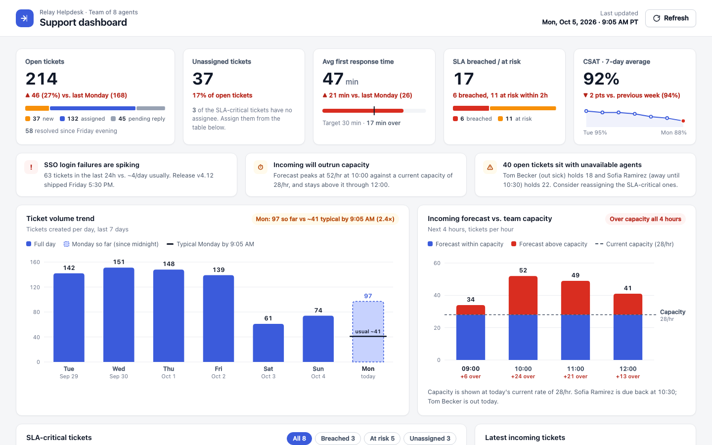
It actually did a decent job.
It has KPIs, alerts, trends, an SLA table, and recent tickets. There is no obvious design mistake.
But if I were Nadia, what should I look at first right now, and what should I do first?
The second version: tell it what the user needs to decide right now
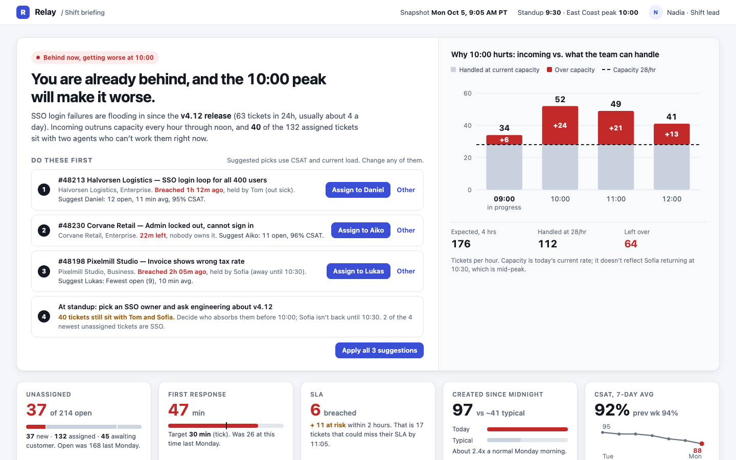
This version opened with a judgment:
“You are already behind, and the 10:00 peak will make it worse.”
Next came “Do these first,” and the capacity chart on the right explained why 10:00 would make things worse.
The KPIs moved below the first screen. The 7-day trend chart and the channel breakdown were gone.
Side by side: where is the difference?
What follows is a scenario walkthrough, not a user test: I put myself in the position of the shift lead at 9:05 on Monday and imagine what using each page would feel like.
A: tell it what the page should contain
If I were the shift lead: “It’s usable, and the data is all there. But I have to find the focus myself.”
I can see the backlog, SLA, capacity, and anomalies. The complete overview is stronger, and an experienced person can explore and judge for themselves.
But with the 9:30 standup coming, I still have to piece several areas together myself: what the biggest risk is, why it is happening, and what to deal with first.
B: tell it what the user needs to decide right now
If I were the shift lead: “Once I open it, I quickly know what today’s problem is, and which few things to do first.”
B does not put all the information on the first screen. It first answers: what is happening now, why 10:00 is dangerous, and which things should be done first. The capacity chart mainly explains “why.”
What really changed was the steps in the middle
A is not unusable. It is more like a complete data workspace, and an experienced shift lead can work through these steps without difficulty. The cost is only this: from “data” to an “actionable briefing,” most of the organizing in between is done by the person.
A the system prepares the data; the judgment mostly stays with the person
Data → the person organizes → the person summarizes → the person decides
- Open the dashboard
- Look at KPIs, SLA, capacity, alerts
- Find today’s biggest anomaly yourself
- Piece together information from several areas
- Turn it into “what to say at 9:30” yourself
- Decide what to handle first yourself
- Go to the standup / act
Keepsthe full overview, more room to explore, freedom for experienced people to judge
Costswhen time is short, the person has to do more of the synthesis
B the page does part of the organizing first; the person confirms and decides
Data → the page organizes first → the person confirms / adjusts → the person decides
- Open the page
- First see “what is the biggest problem right now”
- See the 10:00 risk and its cause
- See the few things to do first
- Check whether the evidence and suggestions make sense
- Confirm or adjust
- Go to the standup / act
Gives up or weakenssome of the global view, information that is not urgent right now, some default dashboard modules
Gainsmore direct risk, more focused cause, a clearer order of action, less organizing before the standup
Legend: prepared by the page left to the person
B is not more complete either. It is simply closer to the task of this specific moment: it moves part of the organizing work from the person to the page. The final judgment still belongs to the person. The page simply moves some of the upstream organizing forward: spotting anomalies, gathering information, shaping the briefing, and prioritizing actions.
This is also why I later came to feel that the difference is not only visual hierarchy, but whether the earlier product judgment has been carried into the page.
A has its own strengths: it is more complete, better suited to a broad overview, and an experienced user may prefer to keep that information.
B’s advantage comes from the task at hand: time is short, the standup is about to start, the 10:00 peak is approaching, and staffing and tickets need immediate adjustment. For that task, it deliberately gives up some of the broader overview.
This is only a difference that appeared in these generations. It is not a general rule.
So were my first guesses right?
Let me go back through them one by one.
Visual finish: not entirely unrelated, but it does not look like the main cause.
The two versions share a very similar visual language: cards, charts, alert colors. B did not pull away from A by adding more polish.
The information-hierarchy hypothesis was right.
B’s emphasis, order of action, and evidence are all more focused and clearer.
But that raises another question: why did B naturally end up with that kind of hierarchy?
Because Prompt B first said who is using the page, why they are opening it right now, what they need to decide, and what can be dropped. The hierarchy follows from those.
So information hierarchy may only be a result. The more upstream question is whether a judgment was made first: what is this page actually supposed to help the user decide?
Maybe “demo feel” is not quite the right phrase
After looking at these two versions, I actually felt that “demo feel” may not be a very accurate phrase.
The first version is not crude, not ugly, and functionally complete. On its own, it is perfectly competent.
What felt different to me is that many of its choices look as if they simply grew out of the task of “making a dashboard”: a row of KPIs, two charts, a table, a column of recent activity.
Each choice has a reason, but nobody has seriously ranked their priority.
Sometimes what I had been calling a “demo feel” seems closer to what I’d call a default-output feel.
The page is out, but the judgments may not be done
With vibe coding, a vague request can quickly become something that already looks finished.
Once the result appears that fast, a choice nobody has seriously made can easily look like a choice that has already been made.
Something similar happened on the homepage of my own site.
Hero, Featured, Recent, Series, Thinking, Projects: each had its reason.
Put together, they said, “I’m doing a lot of learning, experiments, and projects.”
What I actually wanted to say was how I face problems, make judgments, and then build things.
This is not only something that happens with Agents. Handing a person a list of modules is a different problem from telling them what the user actually needs to solve right now.
A page being out does not mean the judgments before it have been made.
One step further
This does not mean the fix is “just write a more detailed prompt from now on.”
I could write Prompt B because I had already worked out who Nadia is and what she needs to decide at that moment.
If the author does not yet know who matters most, what should be cut, or which decision has not been made, an even longer prompt may not help.
At that point, the more valuable Agent may not be one that guesses for me, or one that keeps making the UI more complete.
It may be one that notices:
there is a decision here that has not been made.
And then hands the question back.
An Agent’s value is not only to keep generating. It may also be to help me see that a decision has not yet been made.
Further reading
The Crit: Does Your AI-Built App Look Vibe-Coded? (Nikki Kipple)
It was one of the original sources of inspiration, but the main comparison in this article comes from my own prompt experiment.